Saturday, 29 April 2017
Friday, 28 April 2017
Final CD Package
Here is what our final CD package looks like on Photoshop before it was printed and put in the CD case.
Here is photos of the final CD package printed out and put into a booklet form.
 |
| Front cover in CD case |
 |
| Back cover in CD case |
 |
| Front cover of booklet |
 |
| Page 1 and 2 of the booklet |
 |
| Page 3 and 4 of the booklet |
 |
| Page 5 and 6 of the booklet |
 |
| Back cover of the booklet |
 |
| The CD inlay |
 |
| The first spine |
 |
| The second spine |
Final Website
Here is a link to our finished band website: https://firelightfalcons.wixsite.com/officialwebsite
Here is a preview of the home page:
Here is a preview of the home page:
Thursday, 27 April 2017
Wednesday, 26 April 2017
Tuesday, 25 April 2017
EVALUATION: Question 3
Here are the time frames for each section:
0.07 - 0.35 = Written feedback about music video.
0.06 - 8.50 = Videos of people giving feedback about music video.
8.51 - 13.02 = Discussing our feedback about our music video.
0.07 - 0.35 = Written feedback about music video.
0.06 - 8.50 = Videos of people giving feedback about music video.
8.51 - 13.02 = Discussing our feedback about our music video.
13.03 - 17.01 = Videos of people giving feedback about our CD package.
17.02 - 20.41 = Videos of people giving feedback about our website.
20. 42 - 24.18 = Discussing our feedback about our CD package and website.
17.02 - 20.41 = Videos of people giving feedback about our website.
20. 42 - 24.18 = Discussing our feedback about our CD package and website.
Monday, 24 April 2017
Thursday, 23 March 2017
Logo update for our band
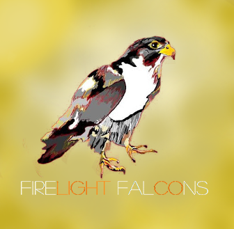
We thought that we should update our logo so that it looks more professional. As a group we thought it was best that we made the typography of the bands name 'Firelight Falcons' the same as it is on our band website and CD pack so it the same throughout are whole product.
Another thing that we changed is the background to a golden colour because we felt that with the bright yellow and red background it looked a bit unprofessional with us doing it on Paint. Therefore, using a more professional software we used Photoshop to make the background gold and then we added in the bands name.
After this we updated the logo on all our social media and YouTube.
Here is how it looks:
Updates and changes to website
Over time we have been making developments to our band's website. These include:
- Changing the background on the majority of the pages as we felt that there were too many trees which meant it got quite repetitive. Therefore, to make it interesting we included some photos we had taken away from setting of the music video which still had a nature aspect to them.
- As a group we thought we should change the font for their band name 'Firelight Falcons' as previously it was quite a bulky font and did not stand out much with it having lower caps other than the start of the words. Therefore, we changed it to 'Marzo' which stands out more as it has a thinner style to the text but puts all the letters as capitals.
- On the ABOUT page we removed the singular shot of one of the band members and added a group one with a slideshow underneath with a picture of all the members individually. Also, we inserted another quote from a made up magazine.
- We added 'Account' and 'Help' buttons as we noticed band websites have them in order to buy merchandise but also for obvious help reasons for new comers to the site.
- We put Spotify and iTunes buttons to the homepage of our website above the album to show the multiple ways people can access music currently, from streaming, buying on an app, as well as ordering a physical copy online through the band's shop.
- On our HOME and MUSIC pages we added our final front cover to our album playlist.
- We rearranged the SHOP page so it looked more professional, this included changing the set out of some of the merchandise and prices, along with the font of the titles. We also put the album into the shop.
- We added another page called the GALLERY which includes behind the scene shots of the band members.
- For the CONTACTS page we created emails for all the addresses we made up so they actually worked.
- Finally, we added a slideshow on our HOMEPAGE of snapshots from our music video and on the VIDEOS tab we added our final music video.
Tuesday, 21 March 2017
Updated photos for CD Booklet
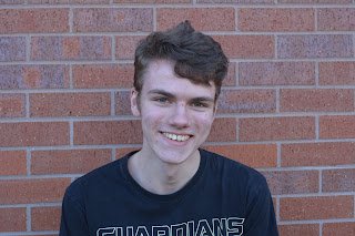
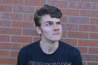
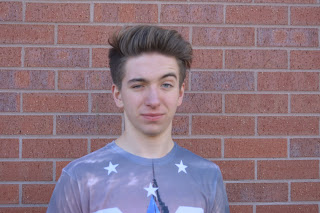
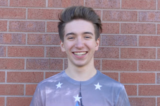
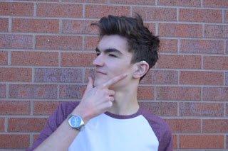
Today we decided that it would be quicker and easier if we asked each band member to take individual mid shot photos of them against a brick wall. The reason we decided to do this is because when it came to editing a brick wall onto each image green screen photo on Photoshop it was taking too long.
Although the previous photos won't go to waste as we have used them as behind the scene photos on our website, as well as, adding some to our About page to introduce the band. Furthermore, Laura edited accurately a long shot band photo onto a brick wall using Photoshop, which we will be using to the back page of the booklet.
The photos that we took today will need to be colour corrected so that they are darker so it matches the rest of the darker themed package.
Here are some of the photos we took:


Sunday, 19 March 2017
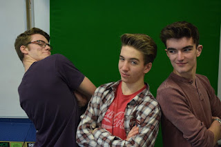
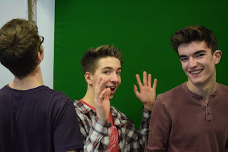
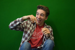
Taking photos for our CD Booklet
We did a photo shoot of our band for our website and the CD booklet insert to make our music video more realistic as usually real artists/bands use pictures on their website and CD's to promote and market themselves to their target audience. To organise the place and time for this photoshoot my group and I created a group chat on Facebook messenger with ourselves and the boys we asked to be our band members to figure out a time and place everyone was free. We decided to do it Monday and Friday break time.
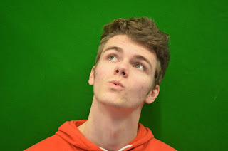
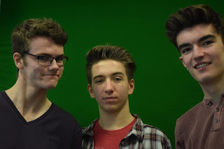
On the Monday we focused on getting shots of the band for the front and back cover, while on Friday we focused more on the CD booklet and website photos. Also, on Friday to make sure that we got enough photos we changed the shutter speed so many photos could be taken at a time and Alex (one of the boys in the band) wore the shirt that the main girl in our music video finds, which shows an intertextual reference to the music video.
Here are some of the photos we took on Monday:



Here are some of the photos we took on Friday:






Wednesday, 8 March 2017
Update on draft
Today we updated our music video again from the feedback we received from our last draft.
Here are the changes we made:
- During the part when the photo is in the sink, ripped and thrown away we added fire overlays to break the shots up and to make it look more dramatic as it builds up with the music until the instrumental when the fast cuts and flashes represent the girl having a breakdown. Also, it is a binary opposite with the water and fire.
- Fixed the timing as the lip syncing was slightly out of sync and adjusted the timings for the fast cuts.
- Changed the coat shot to footage of the main girl walking past as it was more interesting while the previous shot seemed like it dragged on.
- We slowed down the shot of the holding hands as the insert shot of Elsie broke the flow.
- On the word 'stop' we cut to black as it fits the natural pause of the song and makes it more dramatic for what is going to happen next in the narrative.
- We corrected some colour correction with the sleepover having more of an orange tint while the narrative side having a blue tint. We corrected the shot when the girl got home from finding the boys shirt as the camera adjusted to the lighting, so the footage needed a sharper tint of blue as the footage looked a bit grainy and we wanted to make the colour correction more evident.
- We changed the fade out at the end of the video as it stopped a bit abruptly and we wanted it to be smoother.
- We fixed the shot of Elsie clenching her hand by cutting it to a correct moment, duplicating it and putting it in reverse, as it looked a bit anti-climatic and did not fit the song.
We got a teacher to watch it to get a fresh view on it, here is some improvements they suggested:
Monday, 6 March 2017
Friday, 3 March 2017
Glitch effect
We added a glitch effect on the last shot before the instrumental because it segways well into the quick cuts of Elsie having a breakdown as it initiates the broken shots.
Here is a screenshot of how it looks on our video:
Here is a tutorial video we watched on YouTube about how to do the glitch effect:
Wednesday, 15 February 2017
More ideas for the front and back cover
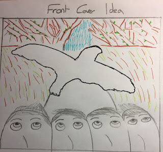
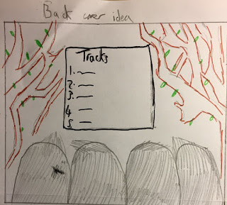
Elsie thought that it would be a good idea to add our band members to our CD's front cover (as it is quite common for artists to appear on the front of their albums, as it is a way to promote themselves). In a previous lesson, I had the inspiration to have our band members face the front of the front of the cover and the back on the back cover while doing my analysis of a band website and seeing a similar concept for the McBusted album cover. Therefore, Elsie came up with a rough idea, where on our own CD, the band could be facing forward (although a lot of their faces wouldn't be shown, due to them not really being shown much in our music video). She then though that it would be a good idea to then show the band on the back cover, as if they were facing away. Elsie then went and drew a rough draft of this idea to see how it would look (and she thought that we could incorporate this into our CD by having the band looking upwards towards the falcon (one of our previous ideas we have talked about) on the front cover, and then the band looking at the track list on the back of the CD.
Here is the rough sketch that Elsie drew of this idea:
Wednesday, 8 February 2017
Sixth day of filming
Today we filmed from 3:30pm - 5:30pm and remembered to book all the equipment we needed (DLSR 4) along with the props (black dress, white cardigan, picture of boy and small box).
To begin with we re-shot the girl opening the box with a picture of the boy in it as we found it difficult to match the lighting with other shots in editing. The reason for this is the original shot was shot at Elsie's house in natural lighting while the shots following it were shot at my house in which we used un-natural lighting.
Next we moved on to redoing the shot of Laura throwing the picture as we found that the original shot was quite blurry as it was too fast, so it was not noticeable and did not have the impact that we wanted when adding it to the music. To fix this problem we decided to do a variety of shots from a close up of Laura's hand before she throws the picture and a long shot of when it is in the air.
Finally, we re-shot the close up of my face for the beginning shot at the sleepover, as when comparing it to the shots of Elsie and Laura we found the lighting was different because we had a much darker background while our faces were lit up. Meanwhile, my original shot was lighter with it being more fully lit due to other lighting than the torch such as the lamps in room. To fix this problem we made sure that we got rid of some of the lamp lighting we used before filming so it did not interfere with how bright the shot was overall. We also tried to put the torch I was holding in a variety of places to see where it would look best in showing the contrast between the bright light and dark background to create a spooky atmosphere.
Here are some screenshots of what we filmed:
Friday, 3 February 2017
Behind the scenes and outtakes
Here is a quick vlog showing some behind the scenes footage and outtakes from our final music video.
Wednesday, 1 February 2017
Day five of filming
Today we filmed again at my house from around 4:00pm - 6:00pm. We remembered to bring all of the props and costumes that we needed (black dress with white cardigan, bag and flannel shirt), along with the equipment (DLSR camera and tripod).
What we filmed:
- We filmed the long shot of Elsie running up the stairs again, as in editing we noticed that she had forgotten to carry the bag (which would cause problems with the continuity within our narrative).
- The close-up shots of Elsie punching the wall is also something which we filmed again, as the previous ones that we had filmed did not look like a smooth match-on-action shot.
- A mid shot of Elsie sliding down the wall.
- An extreme close-up of Elsie clenching her hair in frustration.
- A close-up of Elsie clenching her fist.
- A close up of Elsie's teary eyes (we used mascara here, and decided to smear it down her face to make it look as if she had been crying).
- A long shot and an over the shoulder shot of Elsie throwing clothes down the stairs in anger.
- We then decided to shoot some stop motion footage that we had planned to match to the lyrics 'Ugly is the'. For this, Laura drew a silhouette of a girl holding an umbrella with the rain pouring down (while each rain drop will appear in each frame, to make it look as if it is raining on her).
- Finally, we decided to film the lip syncing part for Laura and me again. We wanted to do this as in editing we found that when it came up to linking up to the music, it looked as if we were both saying different things.
- A shot of Elsie turning the torch on (which will be used for the instrumental at the beginning of the music video, before the singing starts).
Here are some screenshots of what we did today:


Subscribe to:
Comments (Atom)


